
Making movies. Enjoying movies. Remembering movies.
|
|
|
|
|
|
|
|
| Posted November 18, 2004 |
|
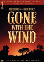
"Gone With The Wind" Collector's Edition
Classic Gets "Ultra-Resolution" Treatment For 65th Anniversary |
By
Bill Desowitz
|
|
Last
spring when Rob Hummel, Warner Bros. Senior Vice President of Production
Technology, announced at NAB [National Association of Broadcasters
convention] that the upcoming “Gone With The Wind” DVD was going to look
the way it originally did when first released in 1939, a prominent studio
preservationist in attendance, asked: “Why?” Although,
philosophically,
that may be the place to start, with its warm, brown color palette – a
result of producer David O. Selznick’s aesthetic preference (no garish
postcard look for him) and the early muted Technicolor dye transfer
printing process – others prefer the 1954 reissue, which is richer and
more full-bodied. But then this has always been the great debate among
purists about the legendary Civil War epic: How should it look?
Admittedly, it’s a judgment call – and you’re playing God.
Unfortunately, ever since they started messing with “Gone With The Wind”
in the late ’60s in efforts to modernize it (beginning with the disastrous
70mm blow-up right up to the cooler and more natural presentations on TV
and home video), we’ve gotten further and further away from its original
Technicolor glory. However, with the new 65th anniversary,
four-disc collector’s edition, released November 9, Warner Home Video has
returned “Gone With The Wind” to a more faithful
representation of its opulent three-strip Technicolor look.
While Warner Bros. ultimately rejected a strict ’39 representation, they
have combined the warmth of ’39 with the richness of ’54 – and the result
is a revelation. At long last, viewers can witness the subtle beauty of
the Oscar-winning cinematography and production design. Sharp and clear,
yet still bearing a restrained palette, Selznick’s cinematic vision of the
Old South comes alive again. We can finally comprehend the grace, grandeur
and destruction amid the tumultuous romance between Vivien Leigh’s
Scarlett O’ Hara and Clark Gable’s Rhett Butler.
Like
“Singin’ In The Rain,” “The Adventures Of Robin Hood,” and “Meet Me In St.
Louis,” new protection masters were made of “Gone With The Wind”
and then scanned into the computer. Warner Bros. then applied its
proprietary edge detection software specifically designed for Technicolor
films, dubbed “Ultra-Resolution.” This software perfectly registers and
aligns the three discrete primary color records as never before. After
intense dirt, scratch, and tear removal, colorist Ray Grabowski corrected
the film using an original reel from a ’39 print and a complete ’54 print
as reference.
“The
’39 reel is very warm and brown, but there’s not a lot of detail in the
blacks,” explained Ned Price, Vice President Warner Bros. Technical
Operations Mastering. “We tried to replicate some of the characteristics,
such as the warmth, along with some of the characteristics of the ’54
print, which has more shadow detail and is richer. Without the reference,
we never would’ve gone this warm on the exterior shots, such as the first
scene.”
Indeed, fleshtones are very warm in characteristic Technicolor fashion –
and we can even make out Scarlett’s eyelashes. But we can actually see the
textures in the costume design. For instance, we can make out the lace on
Scarlett’s white and yellow dress in the opening, and the velvet in her
ultra green dress made from the curtains at Tara. Moreover, during the
Twelve Oaks barbeque, when Ashley (Leslie Howard) and Melanie (Olivia de
Havilland) step out onto the veranda, the background detail is
astonishingly vivid. And the Monster Bazaar contains a proper balance of
red in the sea of tunics and flags.
“There
was a lot of dirt cleaning in the Twelve Oaks sequence,” Grabowski
remarked. “The bad opticals were very hard to match, with lot of cleaning,
and there were so many color corrections with density shifts. We mitigated
aspect ratio shifts [done in ’54 and then again in ’67]. We minimized
flicker and corrected a tear in Scarlett’s yellow hat at Twelve Oaks. We
just wanted to make it as beautiful and rich as you can. The colorist’s
trap is not to make it look like “Oz”… The greatest surprise was how good
the [glass hanging] mattes looked.”
Hummel admitted that this Ultra-Resolution project took a lot longer than
the others, and not only because of the nearly four-hour length. “We had
to go through with the human eye to make registration corrections beyond
the automatic correction in the computer. We register for the eye, not a
mathematical formula. Because of the enormous number of opticals, there
are a lot of splices, which resulted in extensive misregistration. The
software needed to be guided.”
In terms of color, Grabowski said the mandate was to keep the stylized
look as faithful as possible, despite the differences in the two mediums.
It took several passes and much prodding from Price. “It’s hard to meet
the colors,” Grabowski admitted. “We had to mute Gable’s white shirt so we
wouldn’t be blinded. The biggest challenge, of course, was not to
modernize the film so much that it looks like it was filmed today, but to
keep the original feel of it and still make it in the sense of a 2004
transfer with great resolution and a reverence to the original colors.”
Hummel, who is continually amazed by the craftsmanship of the old
Technicolor cinematography, added that there is “so much color information
in the Technicolor records that you don’t have to push it. Even in the raw
scans, the clarity of the image is remarkable.”
How good is this “Gone With The Wind” prepresentation? There is arguably
no better recommendation than from famed restorer Robert Harris (“Lawrence
Of Arabia,” “Vertigo”), who proclaimed: “The new DVD set…is THE classic
release of the year. An extraordinary amount of work has gone into taking
what really are antique film elements and creating something really
beautiful from them.
“The pity is that unless you’ve done it yourself, there really is no way
to explain the amount of time and labor that went into the creation of the
master. Although the public will obviously be pleased with the result, I’m
certain that few will have any idea the debt that is owed to the technical
staff at Warners.”
Bill Desowitz is a freelance writer and the editor of VFXWorld.com and a contributor to the Los Angeles Times, The New York Times, and Wired. He lives in Los Angeles.
Cover Image © Warner Bros Entertainment, Inc. All rights reserved